Test Observability & Engineering effectiveness
“Engineering Effectiveness” has been a central topic of discussion and focus this year
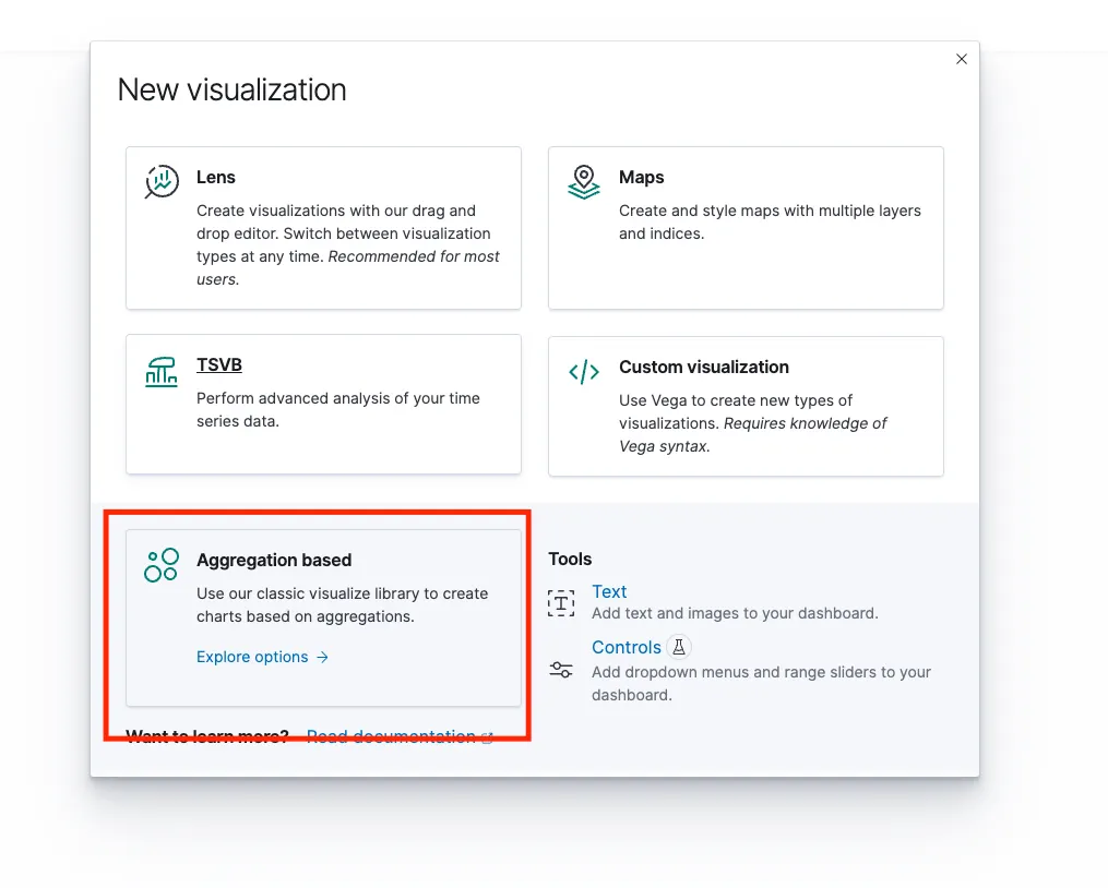
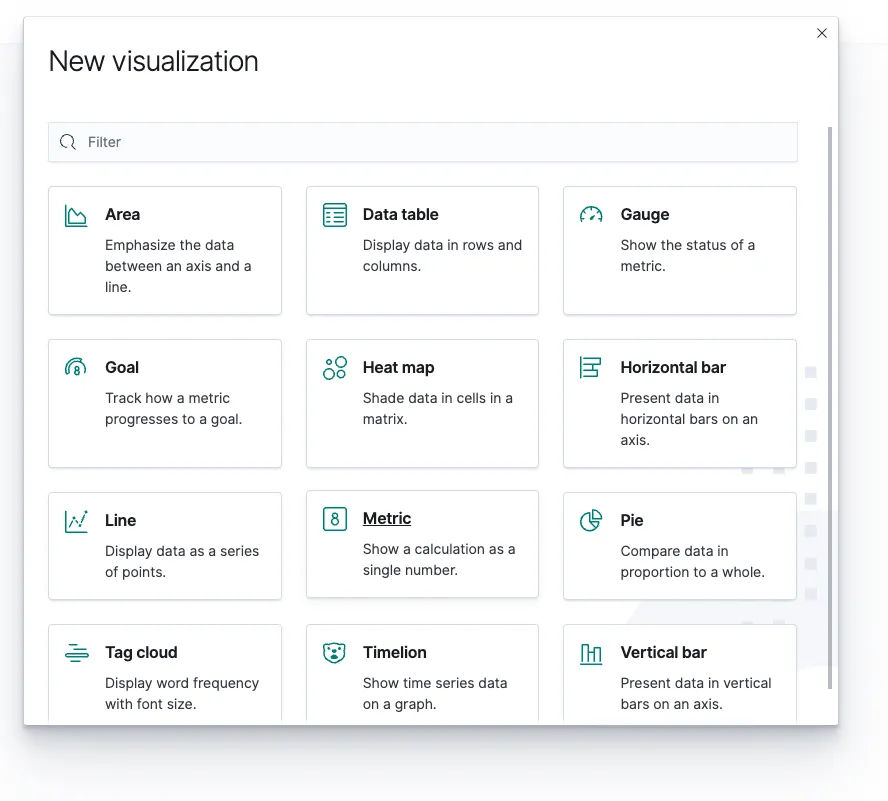
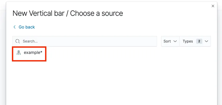
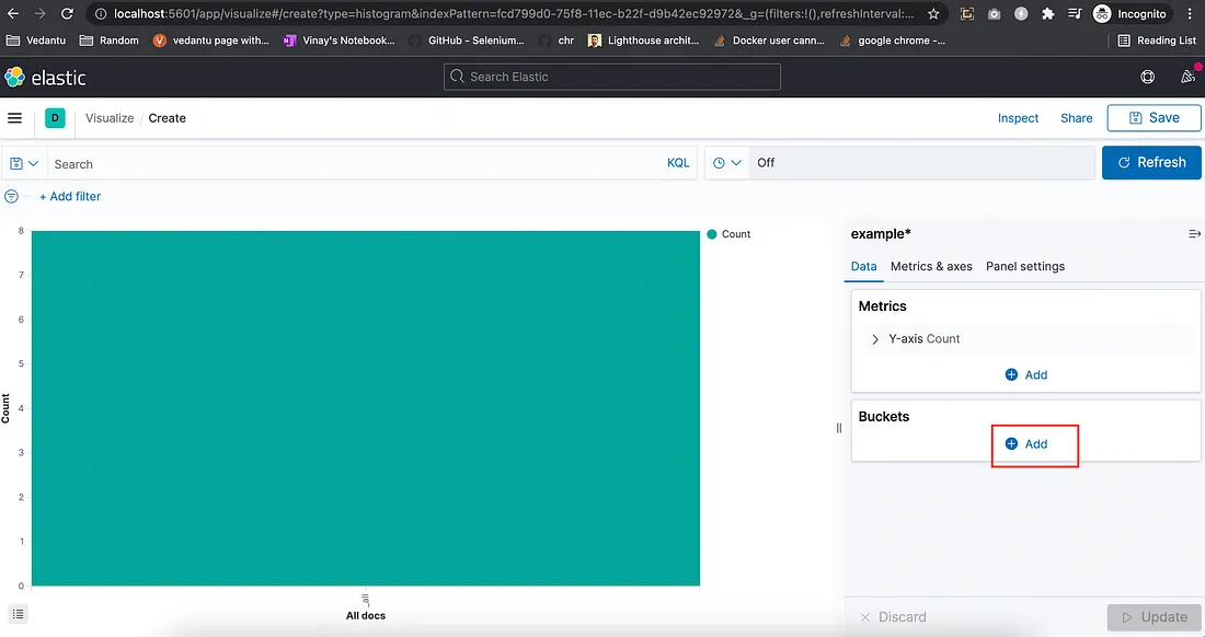

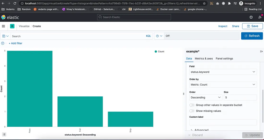

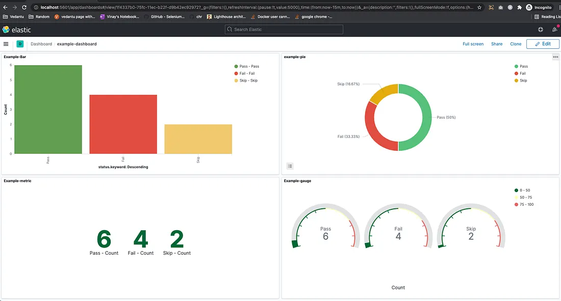
“Engineering Effectiveness” has been a central topic of discussion and focus this year
With us, you’re not just a part of a company; you’re part of a movement dedicated to pushing boundaries, breaking barriers, and achieving the extraordinary.
Otaku 2.0 sought to redefine the way we approach testing, celebrate the spirit of innovation, and pave the way for a brighter future in tech.