Test Observability & Engineering effectiveness
“Engineering Effectiveness” has been a central topic of discussion and focus this year

How to Build Real-time Test Case Monitoring Dashboards?
Inmy previous blog, We learned how we can monitor logs of our test cases in real-time by implementing ELK, and we were able to see the logs on Kibana.
In this blog, we will be looking at how we can represent the same data in a graphical format which will be very easy to understand and even a non-tech person will be able to read and understand.
To do this will take the help of Dashboards in Kibana.

To start, We need elasticsearch and kibana servers to be up and running. You can find out how we can start these servers in my previous blog here.
So now, we are aware that we need to ingest test cases data inside elasticsearch for indexing (refer to the previous blog). Now we will need to create a dashboard using the same data that we inserted in elasticsearch.
Since we already have ingested the data inside elasticsearch in my previous blog. Now we will directly have a look at how to visualize in the form of graphs, pie-charts, etc. So to do this navigate to the below link in the browser.
http://localhost:5601/

2. After clicking on Visualize, You will be able to see an option – Create visualization, click on it.
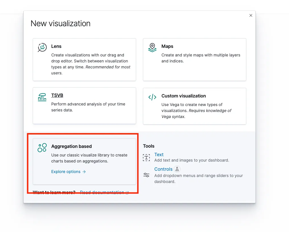
3. Next, There would be some set of visualization options, We will be selecting Aggregation based. (You can explore others as well).

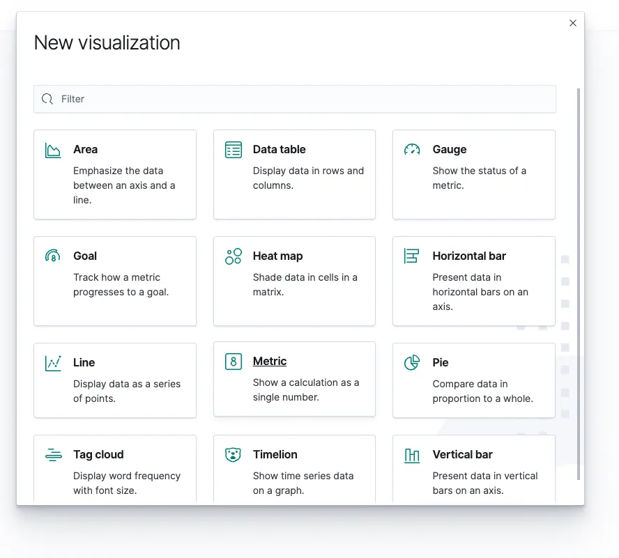
4. Under Aggregation Basis, We will get a lot of options, these are the format in which we need the report to be visible like Graphs, Pie-chart, Vertical bar, Horizontal bar, etc.
5. You can select any one of them, we will select the Vertical bar for now.

6. Now we will select the index that we had created while creating the index pattern.

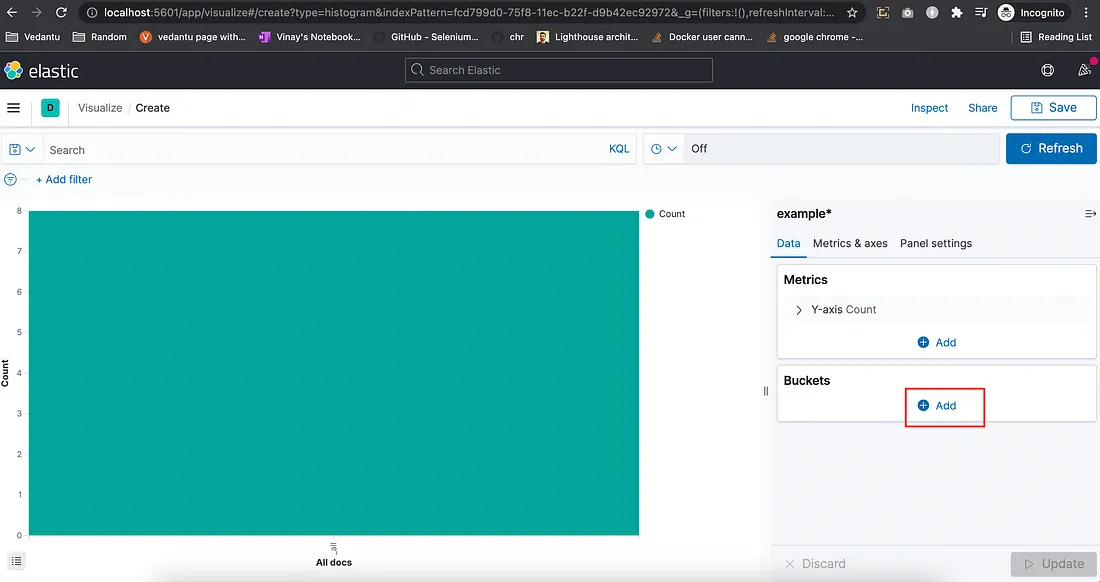
7. Upon selection of the type (index) Vertical bar will get added. But for now, It has all the set of statuses that we had pushed while ingesting the data via API like Pass, Fail, Skip.
In the below image, On the X-Axis you can see it is showing as ‘all’.

We now need to create separate vertical bars for separate status for now we have three statuses as Pass, Fail & Skip.
8. To get separate Vertical bars, Click on Add under buckets on the right-hand side and select the X-axis. Under Aggregation drop-down, Select Terms
9. Now under Field drop-down menu, Select status.keyword since we want our reports to show the X-axis on the basis of “Status”.

10. Click on Update.
We can now see three separate vertical bars for statuses like Pass, Fail & Skip

11. Just click on save and head over to Dashboard (Click on the Hamburger menu and search for Dashboards).
12. There would be two options Create & Add from the library. Click on Add from the library and our saved visual will be populated select it.
That’s it. Now just click on save on the dashboard and we are done.
Now, whenever there will be a new test case ingested these counts and charts will also get updated based on the respective statuses.

If you want to change the colors, Again click on “Add” under bucket → Split series → Select an aggregation as “Terms” → Field as “status.keyword” → Click on Update → Select each status from the below image and change color as per your preference.
Finally, You can also add other types of visualization following the same process and add them to the dashboard.

On a Real-time basis, you can add the data ingestion part in your listeners class under onTestSuccess, onTestFailure, onTestSkipped.
Alerts: Alerts can be configured on the basis of failure count goes below a certain number it should send an alert.
Happy Learning!!
Share This Article

“Engineering Effectiveness” has been a central topic of discussion and focus this year

With us, you’re not just a part of a company; you’re part of a movement dedicated to pushing boundaries, breaking barriers, and achieving the extraordinary.

Otaku 2.0 sought to redefine the way we approach testing, celebrate the spirit of innovation, and pave the way for a brighter future in tech.